Au P'tit Zinc
95 for performance and 100 for accessibility on a photo-led site: that was the challenge.
- Year
- 2026
- Design & build
- 3 weeks
- Stack
- Next.js · React · Tailwind · Vercel
- Design
- Development
- Local SEO
- Photography (direction)
Demo version put online by KAYZEN at a Vercel address; the final domain belongs to the client.

- Lighthouse performance
- 95/100
- Lighthouse accessibility
- 100/100
- Lighthouse SEO
- 100/100
- permanent actions on mobile
- 3
What needed solving.
The background
Au P'tit Zinc is a bistro on quai Pierre-Scize, in Lyon's 5th arrondissement, open since 1992. A neighbourhood favourite known as much for its late-evening atmosphere as for its cooking.
The constraint
The place sells on atmosphere, and therefore on photography: warm light, the bar, a full dining room. Yet a photo-heavy restaurant site is almost always slow — and half of all visits come from a phone, outdoors, at 7.30 pm, to find the address and book.
The response
Make immersion and speed coexist. The first screen shows a large image with loading priority; everything else is deferred. The three real actions — book, call, get directions — are one tap away from anywhere on the page.
The scores recorded at delivery.
Lighthouse scores for the live site. We publish them as they are: when one is low, its cause and the plan to fix it are set out below rather than glossed over.
Every design choice, and the reason for it.
A warm dark theme
Charcoal background, copper accents, amber-toned photography. Dark is not a fashion statement here: it reproduces the light of the place at the time of day people decide to go.
Three actions, always within reach
Book, call, get directions. A sticky action bar on mobile keeps them accessible throughout scrolling. It is the only thing 80% of visitors come to do.
A carousel without traps
Autoplay off by default, keyboard controls, pause on hover and a complete stop if the user has asked for reduced motion. A carousel that advances on its own is the most universally hated component on the web.
Project palette
Charcoal
#171412
Background
Copper
#B4763A
Accents, action
Ivory
#F3EDE4
Text
Bottle green
#2E4034
Secondary sections
Type system
Display
Playfair Display
Body text
Inter 400
A high-contrast serif for the name and headings — the spirit of the zinc bar — and a neutral sans-serif for the menu, which has to be readable in a second.
What's under the bonnet.
- Next.js
- React
- Tailwind
- Vercel
A single priority image
The first-screen image is preloaded and sized via attributes; all the others are deferred. That is what allows a score of 95 for performance on a photography-led site.
Modern formats and served sizes
Each photo exists in several widths, served via srcset. A phone does not download the desktop image — the leading source of waste on restaurant websites.
Third-party booking, but deferred
A third-party booking module weighs several hundred kilobytes. It only loads when “Book” is clicked, not when the page loads.
How the site makes itself findable.
Nearby searches
“Bistrot Lyon 5”, “restaurant quai Pierre-Scize”, “où manger Vieux Lyon le soir” (where to eat in Old Lyon tonight). These are immediate-decision searches, often made less than a kilometre from the restaurant.
Complete Restaurant markup
Restaurant JSON-LD with address, contact details, opening hours, price range, cuisine type and a link to the menu. This is the block Google reuses in the local panel.
Consistency with the Google listing
Name, address and phone number strictly identical, character for character, between the site and the Google Business Profile. Any discrepancy, even in punctuation, weakens local search.
Usable by everyone.
Since June 2025, the European Accessibility Act has required digital accessibility from a large share of online services. We build it in at the design stage rather than retrofitting it.
100/100 on a dark background
The trap with dark themes is grey text on charcoal. Every colour pair was lifted above 4.5:1, and text set over photos sits on an overlay dense enough to hold the threshold whatever the image.
What was delivered.
- Home
- The menu
- The venue
- Book
- Directions and opening hours
- Contact
How the project unfolded.
Photo direction
Selection and retouching: the site is only as good as its images.
Design
Dark theme, action bar, a carousel kept under control.
Development
Priority image, srcset, deferred booking.
Local SEO
Restaurant markup, consistency with the Google listing.
What we are often asked.
More of our work
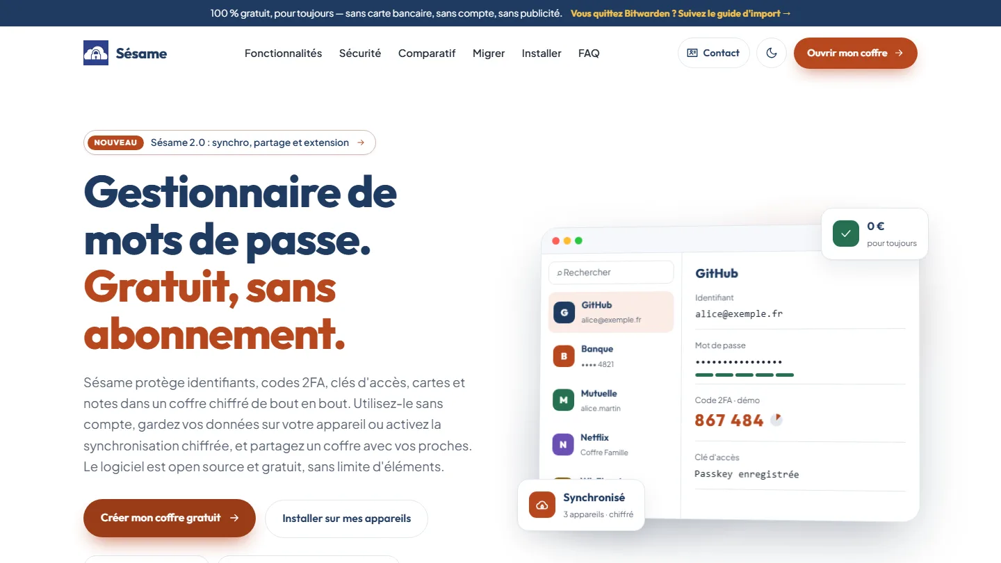 Cybersecurity & cross-platform app
Sésame
A password manager that cannot read your passwords: the architecture was the proof.
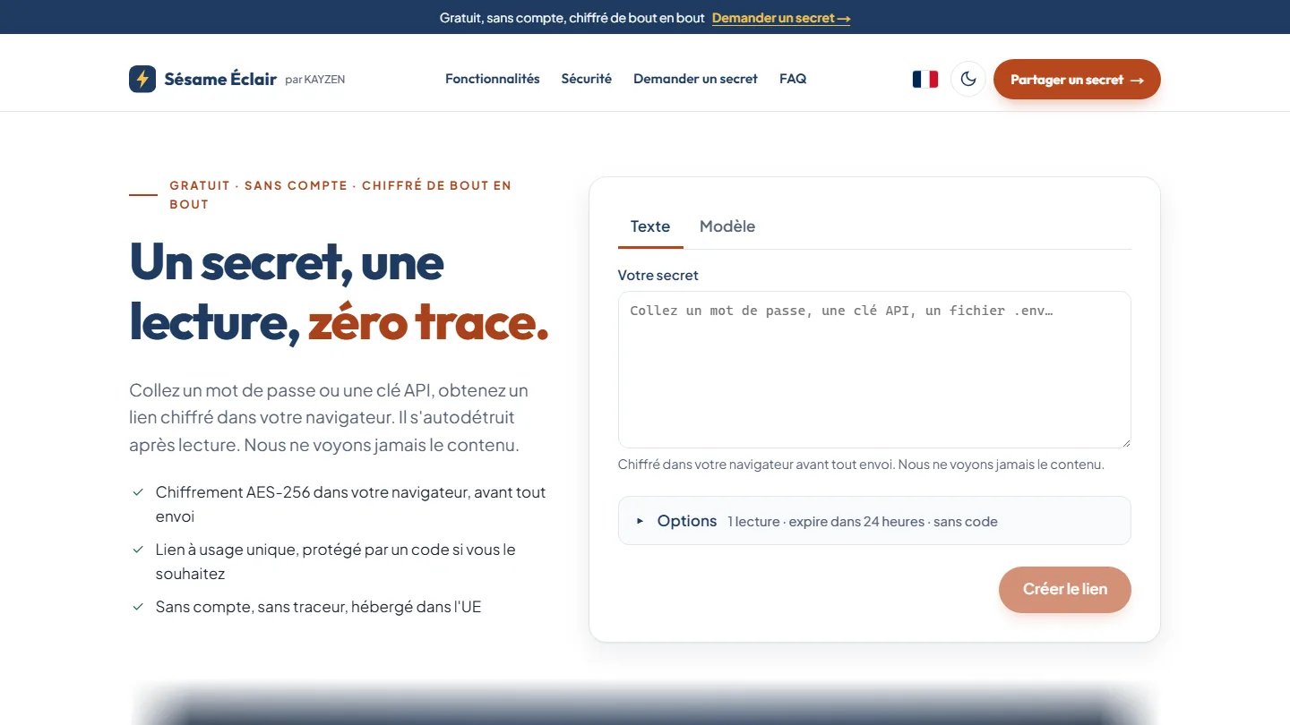 Cybersecurity & web app
Sésame Éclair
One secret, one read, zero trace: the key never leaves the link, the server keeps only an unreadable blob.
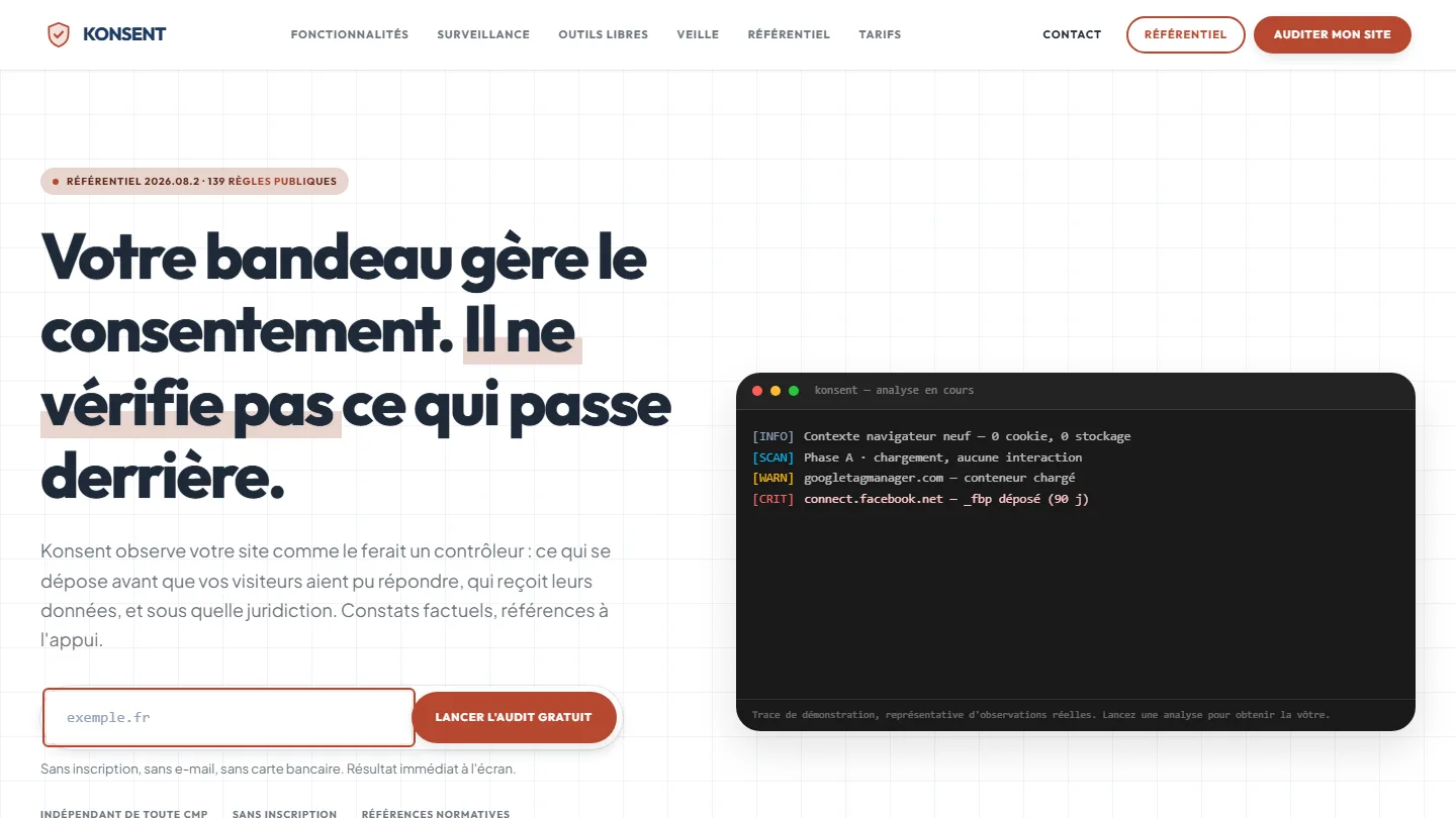 GDPR compliance & SaaS
Konsent by Kayzen
A banner vendor that audits banners is both judge and party: independence was the product.


The same high standards, for your website.
A free audit of your current site, a quote within 24 hours and written reasoning — like the case study you have just read. Pay in three interest-free instalments; local funding schemes checked before you sign.