Damien Mugnier
97, 100, 100, 100: a flawless Lighthouse run on a photo-heavy site.
- Year
- 2026
- Design & build
- 3 weeks
- Stack
- React · Vite · Tailwind · Vercel
- Design
- Development
- Photo direction
- Local SEO
Demo version put online by KAYZEN at a Vercel address; the final domain belongs to the client.

- Lighthouse performance
- 97/100
- accessibility, best practices, SEO
- 100/100
- priority image, all others deferred
- 1
What needed solving.
The background
Damien Mugnier is a tiler and mason based in Beauvallon, south-west of Lyon. He works with large-format tiles, marble, natural stone and terraces, for a high-end clientele.
The constraint
A high-end positioning can only be proven through images: well-laid large-format tiling shows in the joints and the cuts, not in a paragraph of text. So the site had to be highly photographic — which is well known to be the recipe for a slow site.
The response
Treat performance as a design constraint rather than a final optimisation. Every photograph was reworked, recropped and served in several widths before integration even began. The result: 97 for performance on a site whose content is almost entirely visual — and a perfect score on the other three axes.
The scores recorded at delivery.
Lighthouse scores for the live site. We publish them as they are: when one is low, its cause and the plan to fix it are set out below rather than glossed over.
Every design choice, and the reason for it.
The material as the palette
Stone beige, marble grey, deep black. The palette is sampled from the materials laid; the site and the projects speak the same language.
Large images, tight framing
Wide shots of a room drown the work. The framing is tight on the cuts, the joints and the junctions — where you see the difference between a fitter and a craftsman.
Little text, very well written
With this positioning, long text dilutes. Each page comes down to a few precise sentences, using the exact vocabulary of the materials.
Project palette
Stone
#D9CFC0
Background, surfaces
Grey marble
#7F8489
Structure
Deep black
#151719
Text, contrast
Brass
#A3813F
Details
Type system
Display
Cormorant Garamond 600
Body text
Inter 400
A fine, tall serif for the positioning, a discreet sans-serif for information. The typography serves the photos, never the other way round.
What's under the bonnet.
- React
- Vite
- Tailwind
- Vercel
An image budget set before integration
A maximum weight per page was defined at the outset; the images were prepared to stay within it. It is the reverse of the usual approach, where you optimise after noticing the site is slow.
Progressive loading across the board
A single priority image, all the others deferred, dimensions declared so there is no layout shift at all.
No animation library
Transitions are pure CSS. On a site where the images carry everything, adding a hundred kilobytes of animation JavaScript would have cost the performance points that make the difference.
How the site makes itself findable.
Material searches
“Pose carrelage grand format Lyon” (large-format tile laying), “marbre salle de bain sud-ouest lyonnais” (marble bathroom), “terrasse pierre naturelle” (natural stone terrace). High-end customers search for a material, not a trade.
Images described and named
Descriptive alt text and explicit file names. Image search is a real channel for finishing trades.
Usable by everyone.
Since June 2025, the European Accessibility Act has required digital accessibility from a large share of online services. We build it in at the design stage rather than retrofitting it.
100/100 on an image-led site
Every photo carries a useful description — material, format, room — rather than empty or duplicated alt text. A visual site is not doomed to be inaccessible.
What was delivered.
- Home
- Large-format tiling
- Marble and natural stone
- Terraces
- Projects
- Quote
How the project unfolded.
Performance budget
Maximum weight per page set before integration.
Photo direction
Selection, tight framing, multi-width preparation.
Design
Material-based palette, short and precise copy.
Development
Pure CSS, progressive loading, declared dimensions.
What we are often asked.
More of our work
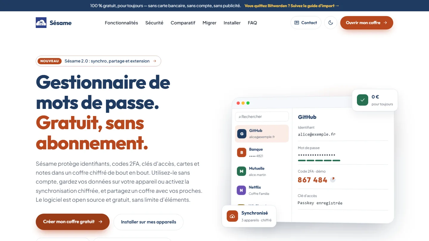 Cybersecurity & cross-platform app
Sésame
A password manager that cannot read your passwords: the architecture was the proof.
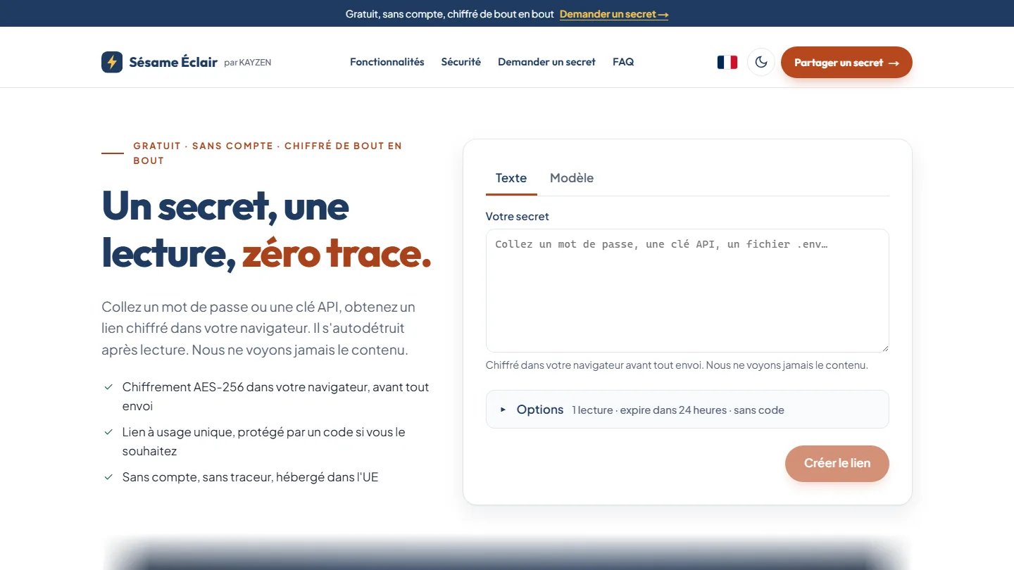 Cybersecurity & web app
Sésame Éclair
One secret, one read, zero trace: the key never leaves the link, the server keeps only an unreadable blob.
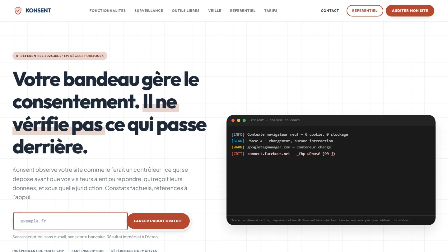 GDPR compliance & SaaS
Konsent by Kayzen
A banner vendor that audits banners is both judge and party: independence was the product.


The same high standards, for your website.
A free audit of your current site, a quote within 24 hours and written reasoning — like the case study you have just read. Pay in three interest-free instalments; local funding schemes checked before you sign.