Net Rénovation
A drylining contractor's site designed for the phone, because that is where his customers are.
- Year
- 2026
- Design & build
- 2 weeks
- Stack
- React · Vite · Tailwind · Vercel
- Mobile-first design
- Development
- Local SEO
- Copywriting

- of visits on mobile
- 80%
- width of the reference mock-up
- 375 px
- performance — work open and costed
- 59/100
What needed solving.
The background
A Lyon-based drylining contractor: partition walls, wall linings, suspended ceilings, interior insulation, for homeowners and renovation projects.
The constraint
More than 80% of visits come from a phone, often from a Google Maps search, during the day. The previous site was designed for desktop and became unusable on mobile: the form off-screen, the phone number not tappable.
The response
Everything was designed first for a screen 375 pixels wide, then widened. The number is tappable at all times, the form fits on one screen, and the services are described in the customer's language — “redo a ceiling”, not “suspended ceiling in BA13 plasterboard”.
The scores recorded at delivery.
Lighthouse scores for the live site. We publish them as they are: when one is low, its cause and the plan to fix it are set out below rather than glossed over.
Every design choice, and the reason for it.
Designed at 375 pixels
The reference mock-up is mobile, not desktop. Designing the other way round always leads to a degraded mobile experience — and that is where 80% of visitors are.
The customer's vocabulary
Services are named the way customers phrase them. The technical vocabulary is there, but at a second level — it reassures without excluding.
Call and quote always within reach
A fixed action bar at the bottom of the screen. On mobile, the bottom of the screen is the thumb zone, and therefore the only position that guarantees access.
Project palette
Slate blue
#2C4A63
Identity
Orange
#D96D2B
Action
Plaster white
#F7F7F5
Background
Ink
#1E2226
Text
Type system
Display
Outfit 700
Body text
Inter 400
Two families are enough; the third, inherited from the original content, is flagged for removal in the optimisation plan.
What's under the bonnet.
- React
- Vite
- Tailwind
- Vercel
A performance job we own up to
59 for performance: it is one of our two lowest scores, caused by a project gallery supplied by the client without optimisation, plus an extra display font. The plan is written — normalising the visuals, removing the third font — and will be applied on the next pass. We show it because hiding a public score has never improved a website.
A forgiving form
Phone numbers are accepted in every common format, with automatic normalisation. Rejecting a number written with dots is an absurd way to lose a customer.
How the site makes itself findable.
“Drylining contractor Lyon” and neighbouring towns
One page per area actually served, with examples of jobs specific to each.
Consistency with the Google listing
Name, address, phone number and opening hours strictly aligned with the Google Business Profile, where most of the mobile traffic comes from.
What was delivered.
- Home
- Services
- Projects
- Service areas
- Quote
How the project unfolded.
Mobile first
375 px mock-up, action bar, form on one screen.
Content
Services rewritten in the customer's language.
Development
Forgiving form, local SEO.
Next
Normalising the visuals and removing the superfluous font.
What we are often asked.
More of our work
 Construction & renovation
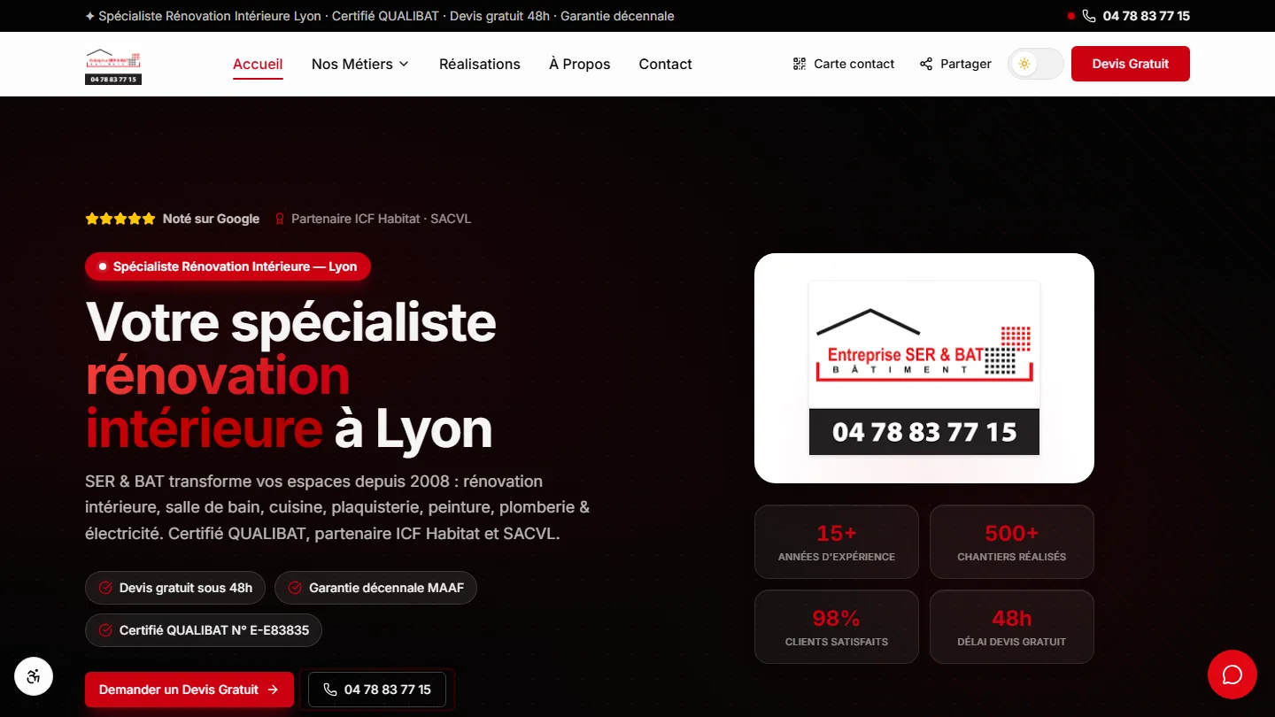
SER & BAT
Two clienteles, one site: a homeowner and a social landlord don't read the same page.
 GDPR compliance & SaaS
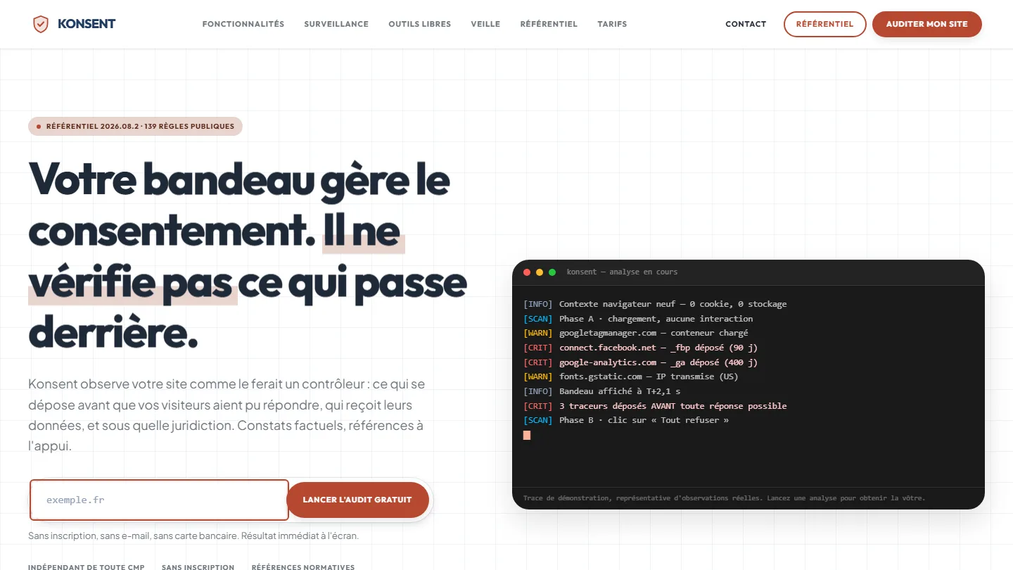
Konsent by Kayzen
A banner vendor that audits banners is both judge and party: independence was the product.
 Offensive cybersecurity & SaaS
Sentinel by Kayzen
Selling a security product to engineers: every claim had to be demonstrable.


The same high standards, for your website.
A free audit of your current site, a quote within 24 hours and written reasoning — like the case study you have just read. Pay in three interest-free instalments; local funding schemes checked before you sign.