Art Scénic
The free trial class was the offer: the whole site was built to lead there.
- Year
- 2026
- Design & build
- 3 weeks
- Stack
- React · Vite · Tailwind · Framer Motion · Vercel
- Design
- Development
- Conversion funnel
- Local SEO
Demo version put online by Kayzen Web at a Vercel address; the final domain belongs to the client.

- Lighthouse performance
- 97/100
- single call to action
- 1
- fields to book a trial class
- 4
What needed solving.
The background
L'Art-Scénic is a theatre company in Écully, founded by Anne Kravz-Tarnavsky, offering productions and drama workshops for children and adults.
The constraint
Workshop enrolments are decided over three weeks in September. For the rest of the year, the site has to keep the name in people's minds. The real trigger for signing up is neither the price nor the syllabus: it is the trial class, which removes the fear of going on stage.
The response
The free trial class becomes the site's single action. Everything leads to it: the home page, every workshop page, the gallery. The form is short and the time slot is offered directly. The production programme is still there, but in the background.
The scores recorded at delivery.
Lighthouse scores for the live site. We publish them as they are: when one is low, its cause and the plan to fix it are set out below rather than glossed over.
Every design choice, and the reason for it.
One action, everywhere
“Book a free trial class” is the site's only call to action. Multiplying competing buttons divides attention — and the conversion rate with it.
Separate workshops for children and adults
Two audiences, two kinds of apprehension, two lines of argument. A parent enrols their child; an adult enrols themselves — the second decision is far harder and needs different words.
A gallery that shows amateurs
The photos show students in workshops, not professional actors. It is being able to picture yourself there that triggers the sign-up.
Project palette
Velvet
#5B2233
Identity
Sand
#F4EDE3
Background
Ink
#1E1A1B
Text
Brass
#B08D4A
Accents
Type system
Display
Cormorant Garamond 600
Body text
Inter 400
A theatrical register without grandiloquence: the company speaks to amateurs, not to critics.
What's under the bonnet.
- React
- Vite
- Tailwind
- Framer Motion
- Vercel
97 for performance, with animations
Framer Motion is only loaded on pages that animate, and every animation is switched off if the user has asked for reduced motion.
A minimal trial-class form
First name, contact details, preferred slot, workshop. Four fields: asking for age, level and motivation would have turned a sign-up into an application file.
How the site makes itself findable.
“Drama classes Écully”, “children's theatre workshop west of Lyon”
Local searches, with a very sharp peak in August and September. The pages are ready well before the season starts.
Course and Event markup
Workshops are Course items with a schedule; productions are dated Events. Two different types for two different realities.
What was delivered.
- Home — trial class
- Children's workshops
- Adult workshops
- Productions
- Gallery
- The company
- Book a trial class
How the project unfolded.
Analysis
The trial class identified as the single trigger.
Design
Single action, two workshop audiences, a gallery of amateurs.
Development
Conditional animations, a four-field form.
SEO
Local searches, Course and Event markup.
What we are often asked.
More of our work
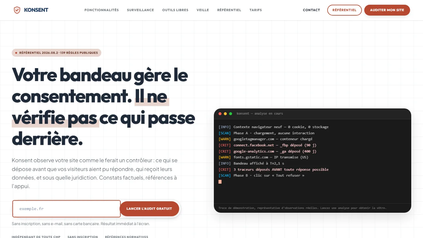 GDPR compliance & SaaS
Konsent by Kayzen
A banner vendor that audits banners is both judge and party: independence was the product.
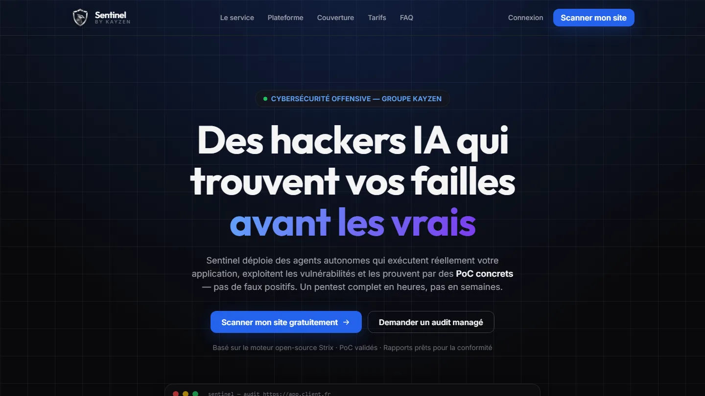 Offensive cybersecurity & SaaS
Sentinel by Kayzen
Selling a security product to engineers: every claim had to be demonstrable.
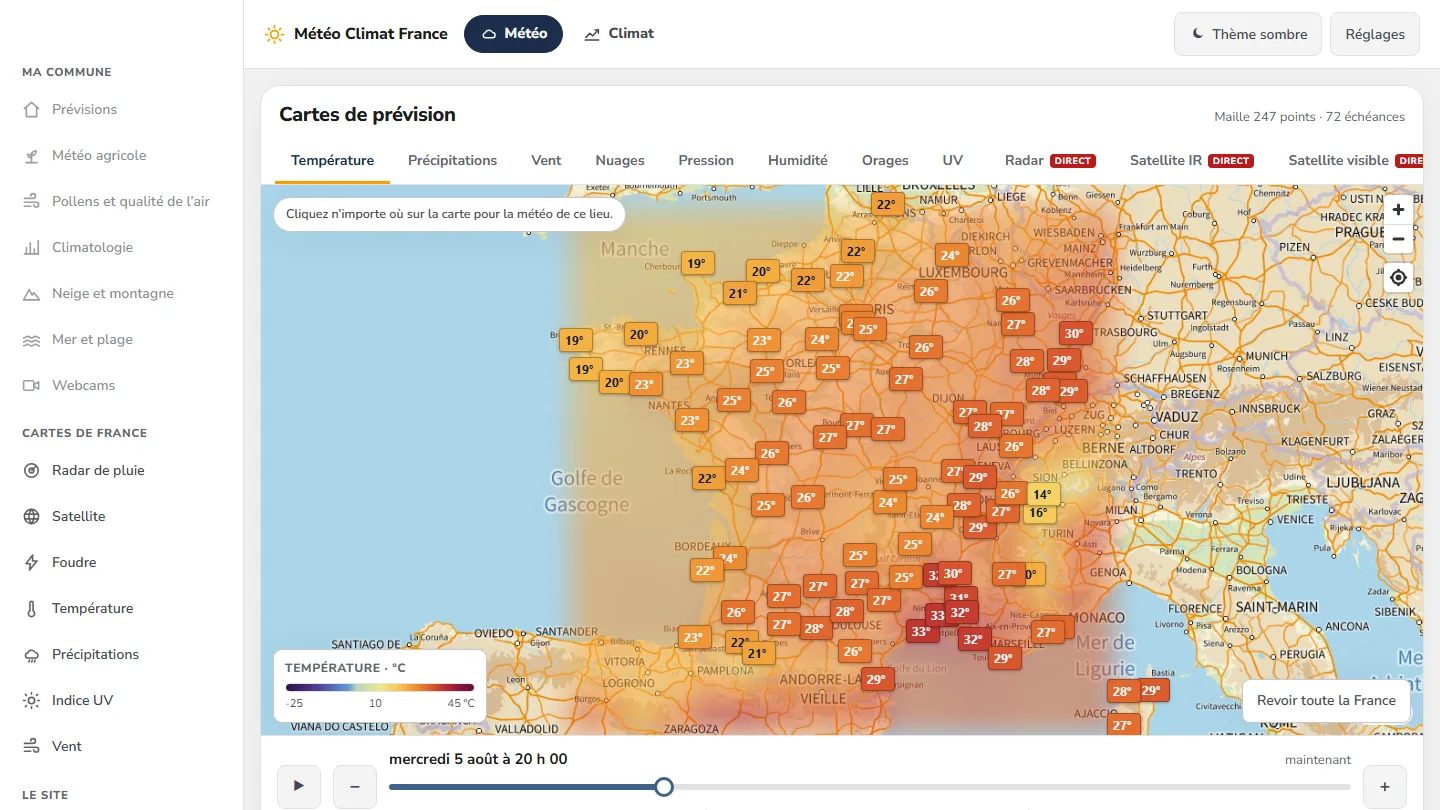 Data & weather service
Météo Climat France
358 indexable pages, a map animated over 72 time steps — and not a single line of framework.


The same high standards, for your website.
A free audit of your current site, a quote within 24 hours and written reasoning — like the case study you have just read. Pay in three interest-free instalments; local funding schemes checked before you sign.