Chez Mounier
A bouchon since 1985: the site had to look as though it had been there just as long.
- Year
- 2026
- Design & build
- 2 weeks
- Stack
- React · Vite · Tailwind · Vercel
- Design
- Development
- Local SEO
- Copywriting
Demo version put online by Kayzen Web at a Vercel address; the final domain belongs to the client.

- year opened
- 1985
- generations
- 3
- Lighthouse accessibility and SEO
- 100/100
What needed solving.
The background
Chez Mounier is a family-run bouchon (a traditional Lyon eatery) on rue des Marronniers, in Lyon's 2nd arrondissement, open since 1985 and run across three generations. Everything is made in-house: quenelles, tablier de sapeur, salade lyonnaise.
The constraint
The bouchon is a codified genre, and its customers are wary of anything new. A site that was too modern would have rung false — and cast doubt on the authenticity of the cooking. The site had to be current in its technology and timeless in its appearance.
The response
Authenticity is proven through detail: the menu states what is homemade, dish by dish; the “about” page tells the story of three generations with dates; and booking stays by phone because that is how this restaurant works. You do not impose a form on a place that answers the phone.
The scores recorded at delivery.
Lighthouse scores for the live site. We publish them as they are: when one is low, its cause and the plan to fix it are set out below rather than glossed over.
Every design choice, and the reason for it.
Gingham tablecloth, without pastiche
Deep red, off-white, a discreet pattern in section backgrounds. The codes of the bouchon are referenced, never literally imitated — pastiche shows, and it backfires.
Homemade, dish by dish
Each dish carries the label when it is prepared on site. It is the bouchon's central argument against establishments that simply reheat, and it had to be verifiable line by line.
The phone as the main action
The call button comes first, permanently on mobile. Adding an online booking module would have created a channel the restaurant does not check — the worst possible scenario for a customer.
Project palette
Bouchon red
#8C2E2E
Identity
Off-white
#F7F3EC
Background
Ink
#231F1D
Text
Olive green
#5E6440
Secondary sections
Type system
Display
Bitter 700
Body text
Inter 400
A warm slab serif for headings — the legibility of a chalkboard menu — and a neutral sans-serif for the menu.
What's under the bonnet.
- React
- Vite
- Tailwind
- Vercel
Static site, free hosting
No application server, no database. The annual running cost is that of the domain name.
A typed menu
Dishes, prices and the “homemade” label in a data file. The seasonal update does not require touching the HTML.
How the site makes itself findable.
“Bouchon lyonnais rue des Marronniers”
Rue des Marronniers is a destination in its own right. Targeting the street rather than the city captures an intention to choose right now, within a two-hundred-metre radius.
Specialities indexed
“Quenelle maison Lyon” (homemade quenelle), “tablier de sapeur”: each speciality is named in structured content. These are searches made by tourists planning their meal.
Usable by everyone.
Since June 2025, the European Accessibility Act has required digital accessibility from a large share of online services. We build it in at the design stage rather than retrofitting it.
100/100 despite a textured background
The background pattern is toned down enough for all text to keep 4.5:1. A decorative pattern should never cost a single point of contrast.
What was delivered.
- Home
- The menu
- The house since 1985
- Directions and opening hours
- Book (by phone)
How the project unfolded.
Tone
Bouchon codes referenced without pastiche, the house's own vocabulary.
Content
Menu with homemade labels, the story of three generations.
Development
Static site, typed menu, calling as the main action.
What we are often asked.
More of our work
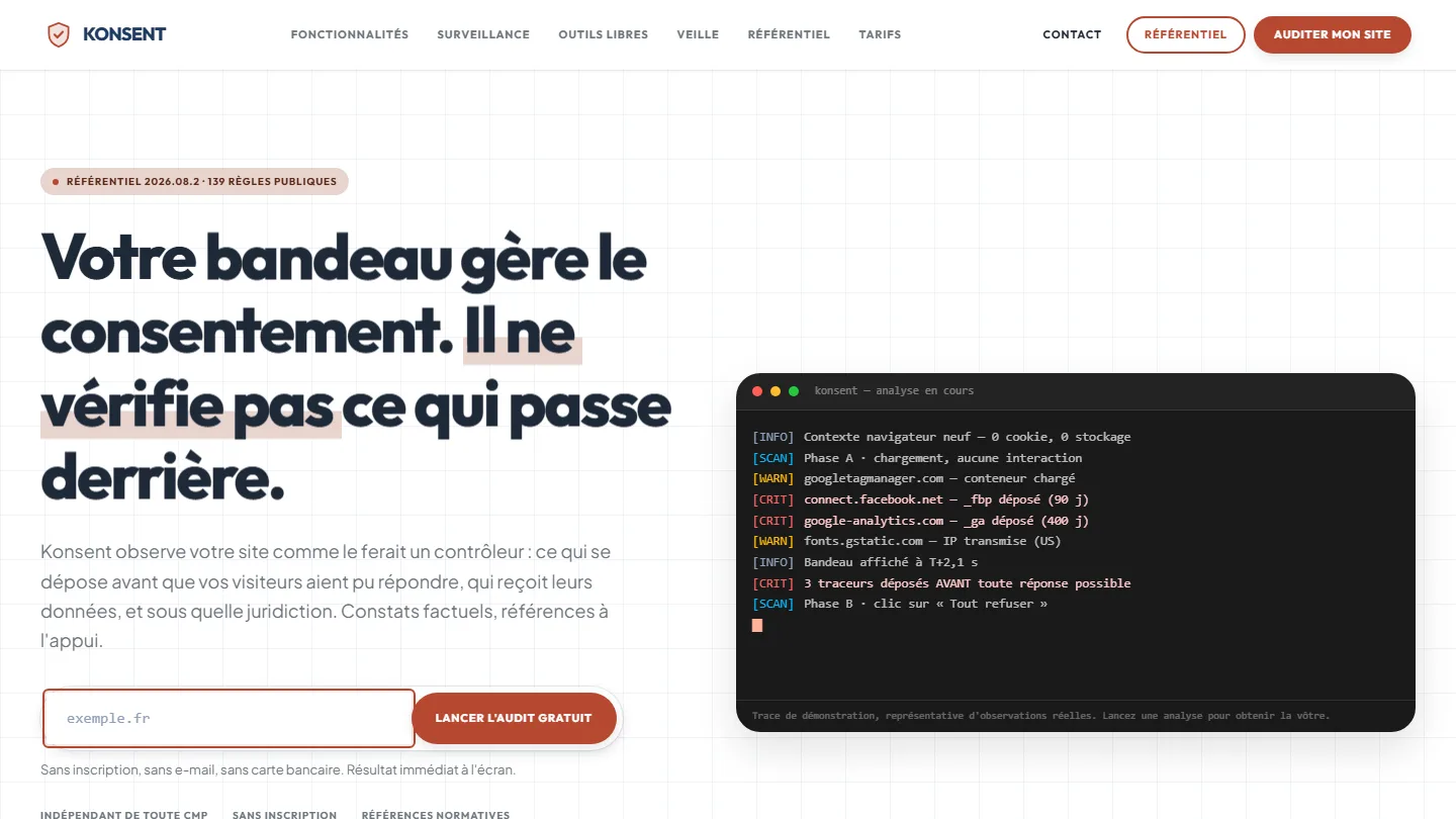 GDPR compliance & SaaS
Konsent by Kayzen
A banner vendor that audits banners is both judge and party: independence was the product.
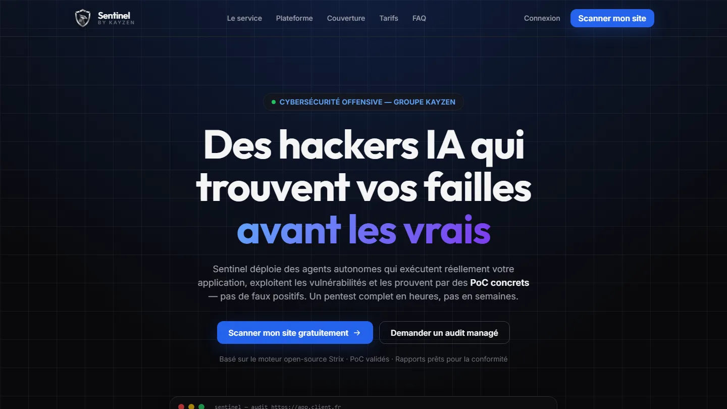 Offensive cybersecurity & SaaS
Sentinel by Kayzen
Selling a security product to engineers: every claim had to be demonstrable.
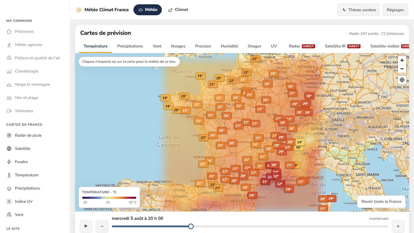 Data & weather service
Météo Climat France
358 indexable pages, a map animated over 72 time steps — and not a single line of framework.


The same high standards, for your website.
A free audit of your current site, a quote within 24 hours and written reasoning — like the case study you have just read. Pay in three interest-free instalments; local funding schemes checked before you sign.