Le Galant
A knife is chosen in the hand: the online shop had to sell at a distance without ever replacing the counter.
- Year
- 2026
- Stack
- Next.js · React · Tailwind · Vercel
- Redesign
- Art direction
- Design
- Development
- Online shop
- Local SEO
- Copywriting
- Compliance
Demo version put online by KAYZEN at a Vercel address; the final domain belongs to the client.

- Lighthouse performance on mobile
- 96/100
- Lighthouse accessibility, best practices and SEO
- 100/100
- layout shift measured (CLS)
- 0
- pages in the sitemap
- 40
What needed solving.
The background
Le Galant is the cutlery house of Hubert, a former Compagnon du Devoir (France's guild of travelling journeymen) who came up through the workshops of Thiers. He designs three models — Le Galant, Le Marinier and Le Fair-play — each made as a folding knife and as a table knife, signs his blades “Par h.D” and presents them himself in his shop-showroom on the quay at Serrières, in Ardèche, on the banks of the Rhône.
The constraint
A knife is chosen in the hand, and the house says so itself. The online shop therefore had to pull off two things at once: sell, at a distance, a €220 piece that cannot be weighed in the palm, and make people want to drive out to Serrières. All of it for a craftsman working alone, with no technical team, and within the strict rules of distance selling: information before payment, online withdrawal, sales restricted to adults.
The response
The site picks up the conversation at the counter. Three models introduced by their temperament rather than by a grid of part numbers, a guide in three questions, a comparison tool that repeats only what the product pages say, and the Serrières shop treated as a destination. Nothing is claimed without support: the Google rating carries the date it was read, the photos are stated to be real, and the accessibility page spells out what has not yet been audited.
The scores recorded at delivery.
Lighthouse scores for the live site. We publish them as they are: when one is low, its cause and the plan to fix it are set out below rather than glossed over.
Every design choice, and the reason for it.
A dark case, a single metal
A near-black background, ivory text, and brass as the only accent, reserved for actions. The wooden handle and the mirror-polished blade stand out as they would in a cutler's display case; a light theme remains available for anyone who prefers to read on a paper-coloured background.
Three knives, three temperaments
The everyday knife, the knife of the river men, the knife of shared meals: each model is introduced by its use before its specifications. The same three lines exist as folding knives and as table knives, which brings the house's catalogue down to six pieces that are easy to place.
The guide that asks the counter's questions
“Which knife should I choose?” comes down to three questions — use, budget, occasion — and suggests up to three knives from the catalogue, with what their product page says. It is the exchange the customer would have had in the shop, with no virtual salesperson and no endless questionnaire.
A comparison tool that admits its gaps
The three folding knives are compared side by side on the basis of their product pages: use, steel, blade length. When a piece of information is not specified, the table shows a dash instead of a made-up value.
The shop as a destination
The showroom page gives the address, the directions and one simple piece of advice: call before making the trip. Some customers want to feel the weight before they buy; the site organises that visit instead of competing with it.
Project palette
Case black
#131313
Dark theme background
Brass
#C5A059
Actions and accents
Light brass
#E9C176
Eyebrow headings
Ivory
#E5E2E1
Text
Paper
#FBF9F5
Light theme background
Type system
Display
Playfair Display 500
Body text
Plus Jakarta Sans
A high-contrast serif for the headings, close to the engraving on a blade; a crisp sans-serif for prices, specifications and legal notices, which must read effortlessly.
What's under the bonnet.
- Next.js
- React
- Tailwind
- Vercel
A basket without an account
Ordering requires no account. The basket can be edited right up to the end, the summary sits just before the “Order with obligation to pay” button, and the customer chooses between collection at the showroom and delivery. Payment is made by bank transfer, using details sent by email.
Withdrawal one link away from every page
The “Withdraw from the contract here” link appears in the footer of every page and leads to an online withdrawal process, with no account needed. The exception is explained where it applies: on the product page, custom engraving is flagged as excluded from the right of withdrawal, with the relevant article of the French Consumer Code cited.
Engraving kept out of the checkout
Laser engraving of the blade cannot be ordered online: it is first requested by message. A misspelt first name on a personalised piece cannot be put right; a prior exchange is better than a free-text field in the basket.
Real photos, light page
Each product page opens on a swipeable viewer of three views, completed by two real photos of the knife half open and then open. Images are served at the right dimensions and in modern formats: 96 for performance on mobile, with no layout shift at all.
How the site makes itself findable.
Serrières first
The titles say “cutler in Serrières (Ardèche)” and the shop has its own page, with address, phone number and directions. Thiers is mentioned for what it is in Hubert's career — the place where he trained — without turning it into a claim of origin.
Structured data by range
Organisation, website and shop are described across the whole site; each product page carries a product group with its handle variants and its breadcrumb trail; the FAQ on the home page is marked up. A search engine reads the catalogue without having to guess it.
Reviews quoted by the rules
The rating from the Google listing — 4.8/5 from 32 reviews — is displayed with the date it was read, a link to the source and a note that the reviews are neither verified nor edited by the house. Social proof the visitor can count again for themselves.
Usable by everyone.
Since June 2025, the European Accessibility Act has required digital accessibility from a large share of online services. We build it in at the design stage rather than retrofitting it.
100/100 measured, no conformance claimed
The site was designed with WCAG 2.2 level AA as the target and scores 100/100 in automated checks. Its Accessibility page nevertheless states that no audit has been carried out yet and that the site must be regarded as non-conformant until an audit establishes otherwise: an automated score is not a declaration.
A display settings menu
Text size, higher contrast, more spacious text, a more legible font, underlined links, reduced animations: six settings gathered in a menu present on every page, remembered in the visitor's browser and nowhere else.
Forms that explain themselves
Required fields are indicated in plain words and every error is described in text, next to the field concerned. Ordering and withdrawal alike are done without an account, and so without a password to remember.
What was delivered.
- Home
- Folding knives
- Table knives
- Kitchen knives
- Accessories
- Which knife should I choose?
- Giving a knife as a gift
- The workshop & Hubert
- The Serrières shop
- News
- Contact
How the project unfolded.
Audit
Review of the existing shop, built on WordPress and WooCommerce, and inventory of the catalogue to carry over.
Content
Product pages rewritten from the actual specifications: Z40C28 steel, blade lengths, handle woods.
Design
Dark case, brass, three models staged, the Serrières shop.
Development
Catalogue, basket without an account, choice guide, comparison tool, structured data.
Compliance
Online withdrawal, terms of sale, cookies, accessibility page.
What we are often asked.
More of our work
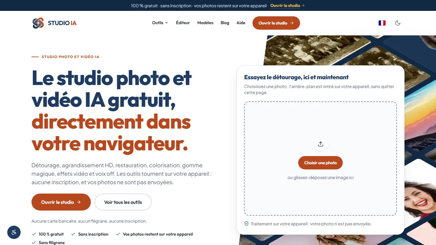 Web application & artificial intelligence
Studio AI
Eighteen AI-powered photo and video tools, each one saying for itself whether it runs in the browser or online: privacy becomes a check box, not a promise.
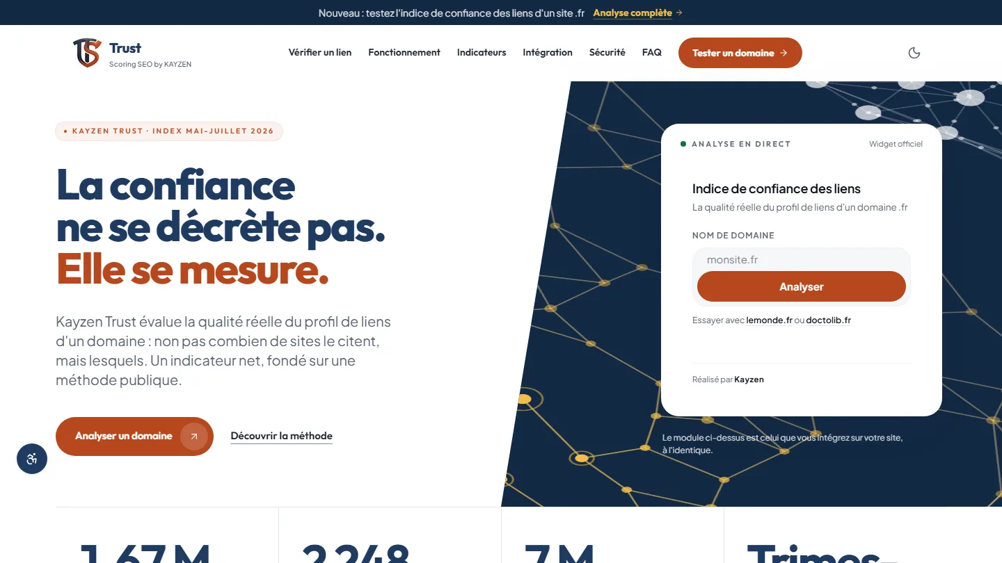 Web application & SEO
Kayzen Trust
A link indicator whose method is published: trust can be measured, and the gap with popularity gives away bought links.
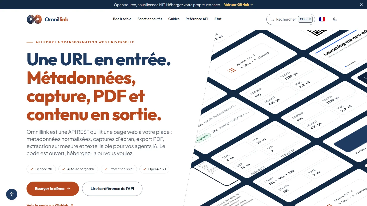 Web application & API for developers
Omnillink
An address in, ready-to-use data out: an API that writes down its limits and attaches its measurements to every response.


The same high standards, for your website.
A free audit of your current site, a quote within 24 hours and written reasoning — like the case study you have just read. Pay in three interest-free instalments; local funding schemes checked before you sign.