Philippe Reynaud
The best design for a photographer is the one you don't see.
- Year
- 2026
- Design & build
- 2 weeks
- Stack
- React · Vite · Tailwind · Vercel
- Design
- Development
- SEO

- typeface family
- 1
- accent colours
- 0
- Lighthouse SEO
- 100/100
What needed solving.
The background
Philippe Reynaud is a fine art photographer: black-and-white prints, exhibitions and sales of original works.
The constraint
A photographer's portfolio is the only kind of website where the design has to disappear. Any colour, any assertive typography, any effect competes with the image — and it is the image that sells.
The response
An interface stripped to the bone: neutral grey, understated typography, minimal navigation. Prints are shown large, on a neutral background, with their print specifications — medium, dimensions, edition. A sale is handled as an enquiry, not as a shopping basket.
The scores recorded at delivery.
Lighthouse scores for the live site. We publish them as they are: when one is low, its cause and the plan to fix it are set out below rather than glossed over.
Every design choice, and the reason for it.
Absolutely neutral grey
No colour cast around the images. A slightly warm or cool background changes how a black-and-white print is perceived — a deal-breaker for a fine art photographer.
Typography that steps back
One family, two sizes, nothing heavier than medium. Titles of works are discreet and placed beneath the image, never over it.
Print specifications on display
Medium, dimensions, edition number. Someone buying a fine art print buys the object as much as the image; this information is part of the work.
Project palette
Grey 950
#111111
Text
Grey 100
#F2F2F2
Gallery background
Grey 500
#7A7A7A
Secondary labels
White
#FFFFFF
Page surface
Type system
Display
Inter 500
Body text
Inter 400
A single family, no heavy weights. On a portfolio, typography is a service, never a signature.
What's under the bonnet.
- React
- Vite
- Tailwind
- Vercel
Images at the resolution that matters
Each print is served at the size actually displayed, in a modern format. On a photography site, rendering quality is the product — under-compressing would be absurd, and so would over-compressing.
One accessibility issue identified
88: a few secondary labels fall below the contrast threshold, a direct consequence of the choice of typographic restraint. The fix is identified and involves no real visual compromise.
How the site makes itself findable.
Artist name and series
The photographer's name is the main search; series and exhibition titles come next. An artist's portfolio ranks on proper names, not on generic keywords.
VisualArtwork markup
Each print carries its type, its author and its dimensions. That is the markup expected for a work of art, and it feeds image search.
What was delivered.
- Home
- Series
- Available prints
- Exhibitions
- Biography
- Contact
How the project unfolded.
Stance
Design steps back so the image comes first.
Design
Neutral grey, a single typeface, print information.
Development
Images at the resolution that matters, modern formats.
What we are often asked.
More of our work
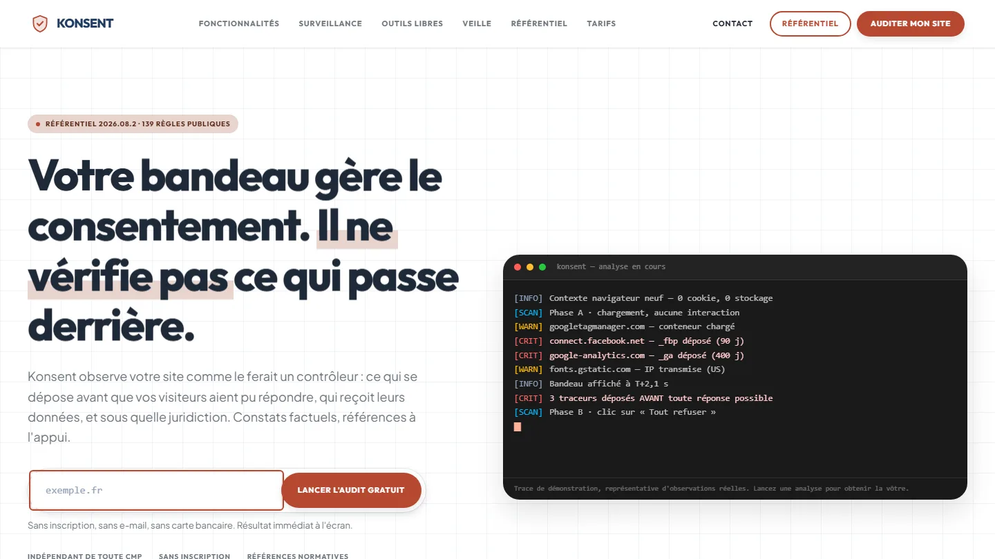 GDPR compliance & SaaS
Konsent by Kayzen
A banner vendor that audits banners is both judge and party: independence was the product.
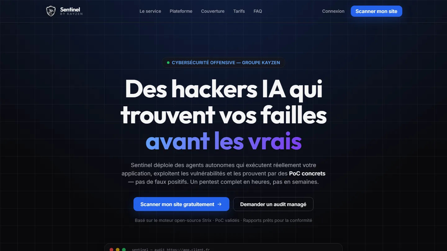 Offensive cybersecurity & SaaS
Sentinel by Kayzen
Selling a security product to engineers: every claim had to be demonstrable.
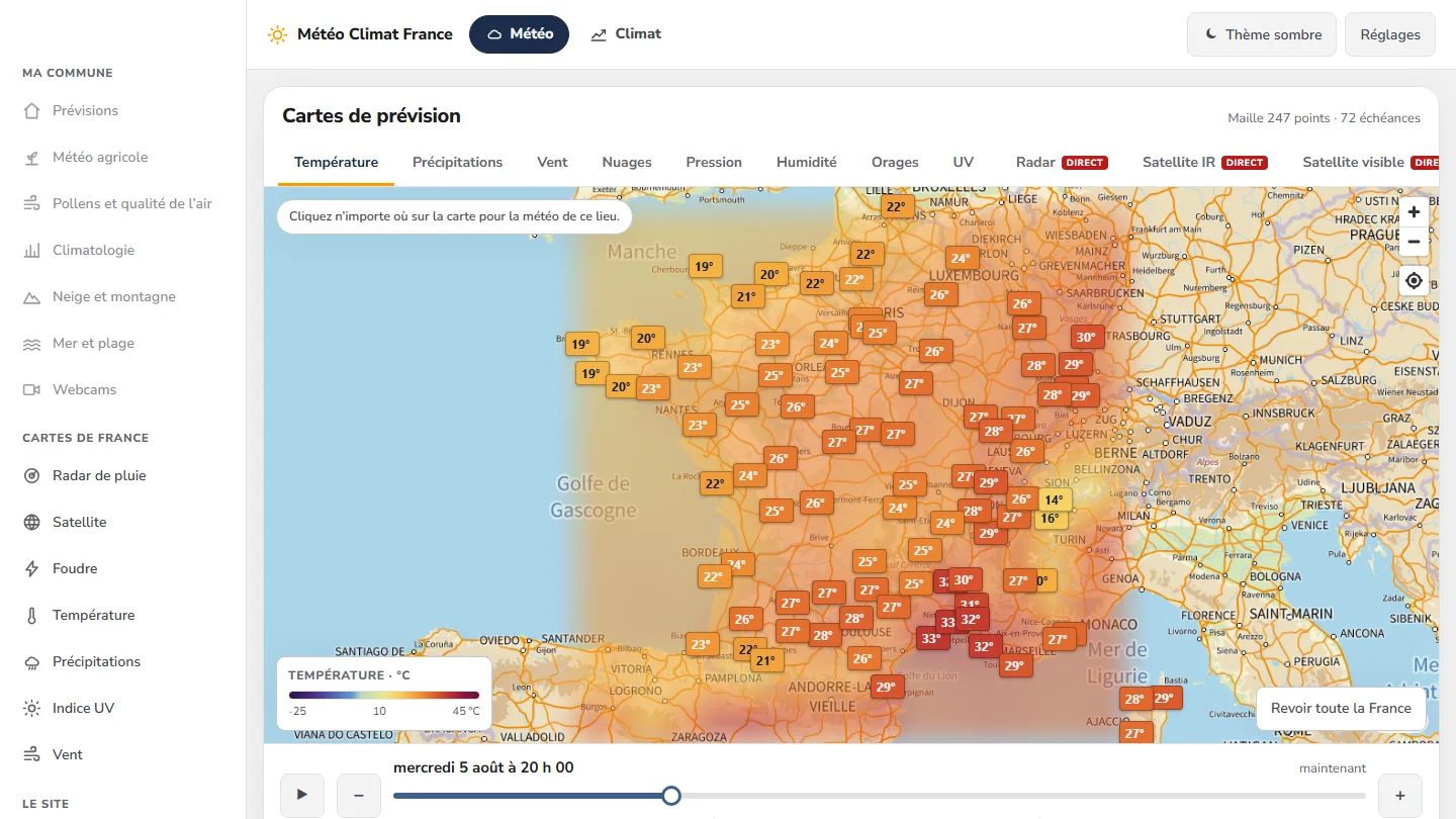 Data & weather service
Météo Climat France
358 indexable pages, a map animated over 72 time steps — and not a single line of framework.


The same high standards, for your website.
A free audit of your current site, a quote within 24 hours and written reasoning — like the case study you have just read. Pay in three interest-free instalments; local funding schemes checked before you sign.