Restomix
The restaurant's QR code was to stop being a PDF and become a sales channel.
- Year
- 2026
- Design & build
- 9 weeks
- Stack
- Next.js · React · TypeScript · Prisma · PostgreSQL · Stripe · Vercel
- Product design
- Mobile design
- Development
- Database
- Payment
Product published by KAYZEN, served at a Vercel preview address pending its final domain.

- for the menu to open on scan
- < 1 s
- Lighthouse performance
- 100/100
- Lighthouse accessibility
- 100/100
What needed solving.
The background
Restomix turns the QR code on a restaurant table into a complete interface: an up-to-date menu, ordering, payment, review collection and footfall data.
The constraint
QR codes have had a bad reputation since 2020, because they were first used to display an unreadable PDF. The product had to wipe away that memory from the very first mobile screen, in unfavourable conditions — a noisy dining room, one hand free, a congested network, a customer in a hurry.
The response
Design the customer view first, never the back office. The menu opens in under a second, with no installation and no account, and stays readable one-handed. The restaurant owner's dashboard came afterwards, shaped by the data the customer view actually produces.
The scores recorded at delivery.
Lighthouse scores for the live site. We publish them as they are: when one is low, its cause and the plan to fix it are set out below rather than glossed over.
Every design choice, and the reason for it.
Designed for the thumb
Category navigation stuck to the bottom of the screen, within thumb reach. Touch targets of at least 44 px. A restaurant menu is read standing up, one-handed, with a glass in the other hand.
Photos optional, never mandatory
Few restaurants have decent photos of all their dishes. The menu stays elegant without images; photos, when they exist, are a bonus rather than the structure of the page.
A dashboard readable at a glance
Restaurant owners check their dashboard between two services. Three figures at the top, the rest below the fold. No chart that demands careful reading.
Project palette
Terracotta
#B7481F
Identity, buttons
Navy
#1F3B61
Headings
Deep navy
#132944
Announcement bar, dark mode
White
#FFFFFF
Background
Type system
Display
Outfit 700
Body text
Plus Jakarta Sans 400
Prices use tabular figures, right-aligned: a badly aligned price column reads like a sloppy menu.
What's under the bonnet.
- Next.js
- React
- TypeScript
- Prisma
- PostgreSQL
- Stripe
- Vercel
Kitchen screen refreshed every eight seconds
The kitchen screen queries the server every eight seconds, and only while the tab is visible. A simple, predictable choice: no permanent connection to keep alive on a dining room's Wi-Fi.
Partitioning by restaurant
Every request checks on the server that the restaurant, menu or dish requested does belong to the signed-in account, through checks gathered in a single module. One restaurateur cannot read another's data, even by guessing an identifier.
Third-party payment
No card data passes through the product. The payment provider handles card entry and PCI compliance; it is the only reasonable choice for a team of this size.
How the site makes itself findable.
SEO focuses on selling the software
A restaurant's menu is not meant to be indexed — it changes every day and answers no search query. Search targets “logiciel commande à table” (table ordering software) and “QR code menu restaurant”: the searches restaurant owners make.
Usable by everyone.
Since June 2025, the European Accessibility Act has required digital accessibility from a large share of online services. We build it in at the design stage rather than retrofitting it.
Menu contrast reviewed
Restaurant menus overuse light grey on white. Every colour pair is above 4.5:1, including prices and allergen information — whose legibility is not just a matter of comfort.
What was delivered.
- Product website
- Customer view (QR)
- Restaurant dashboard
- Pricing
- Account
How the project unfolded.
Customer view
Mobile prototype tested in a dining room before a single line of back office.
Back office
Menus, categories, availability, opening hours.
Ordering and payment
Real-time kitchen feed, payment provider.
Analytics
Footfall, most-viewed dishes, average spend.
What we are often asked.
More of our work
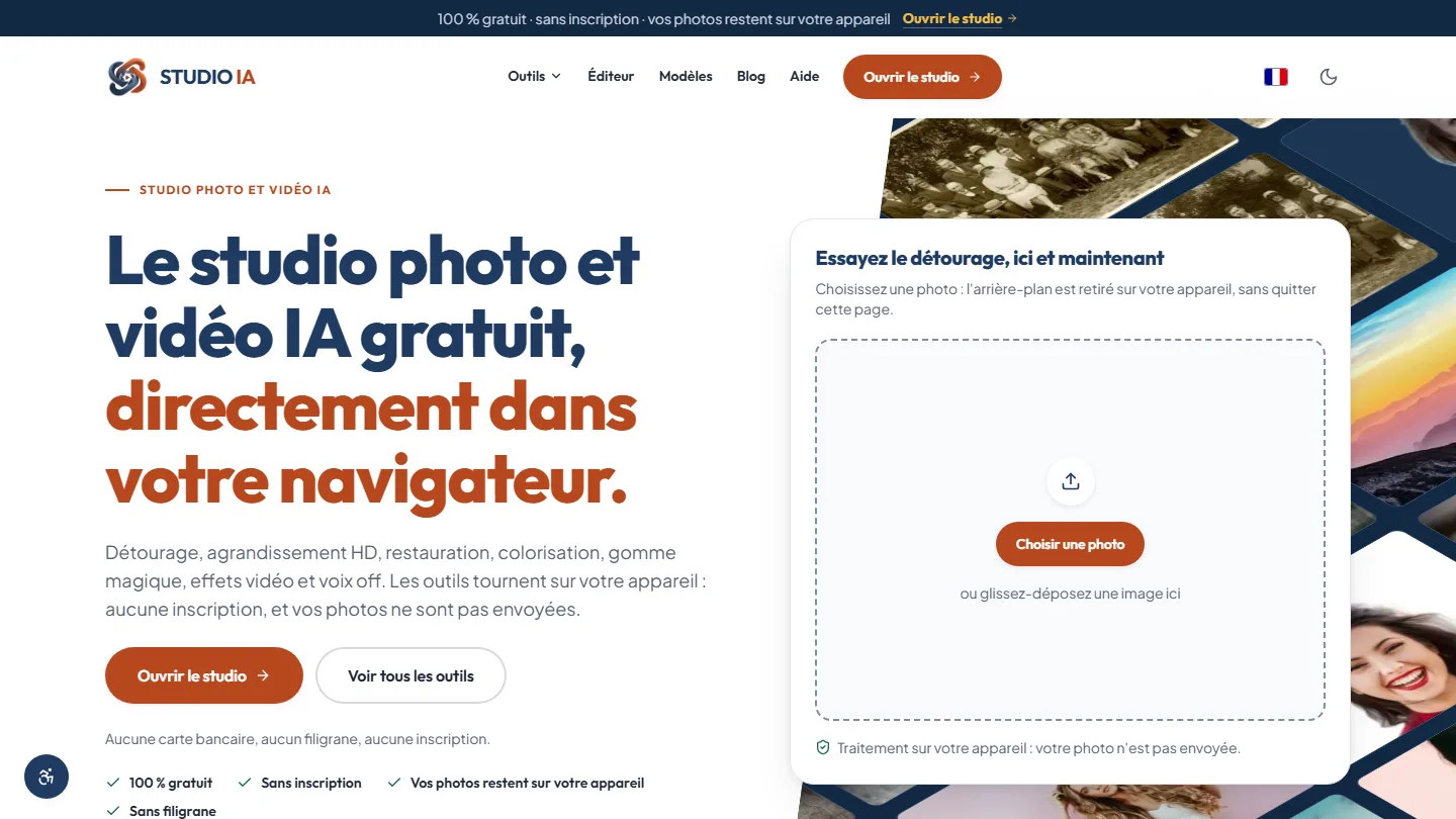 Web application & artificial intelligence
Studio AI
Eighteen AI-powered photo and video tools, each one saying for itself whether it runs in the browser or online: privacy becomes a check box, not a promise.
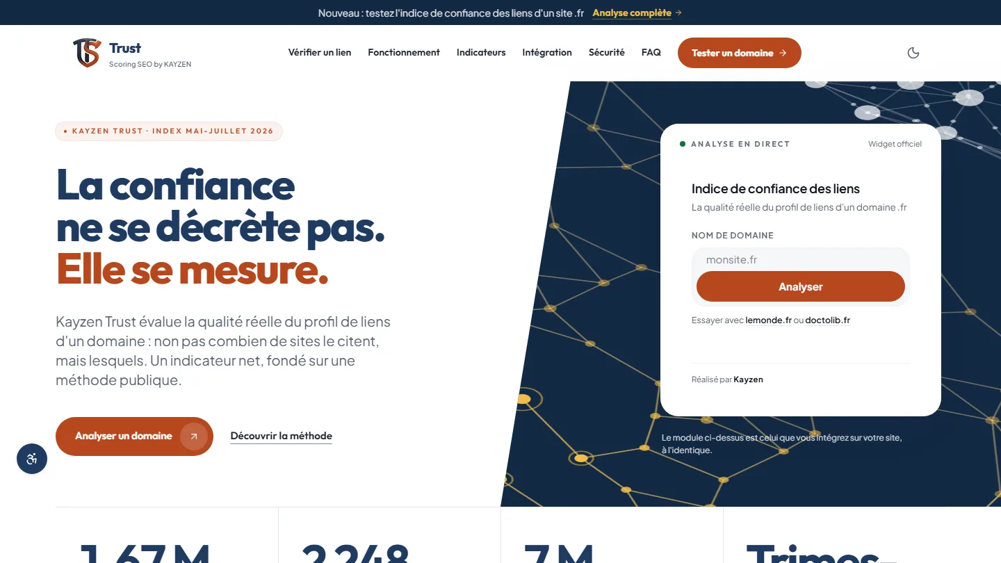 Web application & SEO
Kayzen Trust
A link indicator whose method is published: trust can be measured, and the gap with popularity gives away bought links.
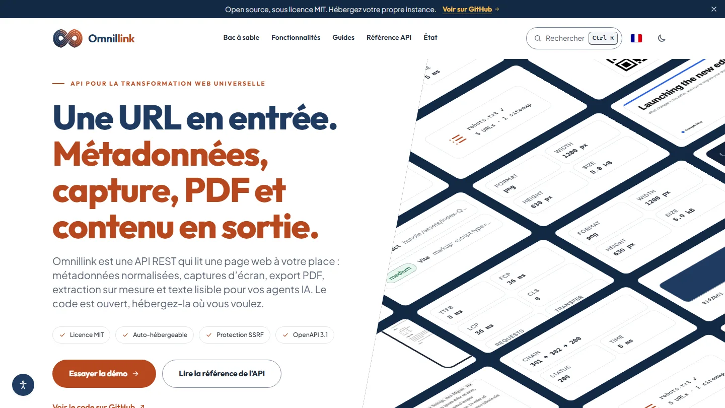 Web application & API for developers
Omnillink
An address in, ready-to-use data out: an API that writes down its limits and attaches its measurements to every response.


The same high standards, for your website.
A free audit of your current site, a quote within 24 hours and written reasoning — like the case study you have just read. Pay in three interest-free instalments; local funding schemes checked before you sign.